
Storm and flood update
Learn more about our flood update and how we can help each other.
Tables and chairs
Bedroom suites
Light fittings
Sculptural art
Outdoor furniture
Kitchens
Shop fitting
Wardrobes
Entertainment units
Vanities
Steel doors
Steel windows
Stairs and handrails
Arbours and gates
Handles and brackets

Working with world-leading metal and wood products to create quality finishes.

Our team is trained in ancient handcrafted skills which are blended with modern cutting-edge technologies.
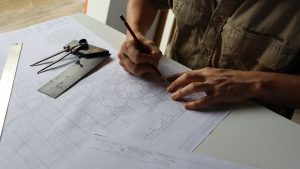
With our extensively equipped metal and wood workshops we are the only business between Brisbane and Sydney that can offer our clients a wide range of in-house services. It all starts with customised design consultation through to fabrication and installation.
With a strong focus on precision, best-practice and sustainability, complex projects can be solved and executed with ease.
From an idea that was born while studying in the Champagne region of France, that became a reality during a chance reunification in Australia, MullumJoinery Wood & Metal offers an extensive selection of products centred around the versatility of metals and the natural warmth of wood.
Learn more about our flood update and how we can help each other.

As the situation of recent national and global events unfold, we want to assure our clients that we continue to be proactive in addressing supply chain changes to ensure we continue to deliver on our high level of service.
This is our business update….
Our reputation as industry leaders in our field for valiant projects is built on word-of-mouth referrals and a portfolio of projects which stand the test of time. We offer a rigorous four-step consultation process with a singular aim: to bring awe-inspiring concepts to life with tangible results. This service is best suited to architects, designers and visionaries looking for sophisticated expertise in interiors and quality finishes.
We have been extremely impressed with Thomas and his colleagues at MullumJoinery. Their professionalism and expertise was evident throughout the whole project of producing and installing metal doors for us. The final price came in under the original quote and was value for money. I highly recommend MullumJoinery.
I have no hesitation in recommending Mullum Joinery to homeowners, builders and architects, or whoever needs their projects done at an affordable cost but highest standard.
Working with MullumJoinery has been such a pleasure. The quality of work was amazing, will 100% be going back and getting more work done and will be telling everyone I know to use them.
MullumJoinery made us a sensational custom reception desk for our new veterinary clinic in Brunswick Heads.
Fantastic service, creative solutions and quality product. Would highly recommend.
I am so happy with the new furniture in my house. I would highly recommend and trust MullumJoinery every time.
We wanted a local joinery company to make and install an unusual bookcase feature in our house. MullumJoinery did an amazing job. There was complete attention to detail, high quality work, excellent communication and they delivered exactly what was asked for on time. Recommend them highly.
When the job was finished I could not believe the transformation.
Having recently just renovated my house I was recommended MullumJoinery for restoring my beautiful Redwood bench tops in my kitchen. They are such a obvious feature as soon as you walk into my house so I wanted the job to be done professionally. I met with Laurent & he came out to visit my property & gave me a very reasonable quote considering the amount of work to be done on restoring these bench tops it seemed like a great deal.
They were very worn down & separating in many places. So the job to even get them off the base was quite a task. Laurent was very friendly & professional when he came to work on my house both visits. It was Christmas time so he was quite busy with lots of work on but maintained communication with me & got the job done in remarkable time before closing up for Xmas break.
When the job was finished I could not believe the transformation. The layers of sanding & polishing was done with great detail & the finished product really shined bright & bought our kitchen back to life. The new tenants now living in the house have commented on what a lovely kitchen it is & the beautiful wood bench tops are definitely the key feature. We were incredibly happy with the job from beginning to end. I thanked him from my heart for such a great job done & even bought him a Xmas present to show our gratitude.
“Laurent & Thomas created and installed all our cabinetry for our new state of the art salad bar/cafe in Byron Bay. Their craftsmanship and professionalism was outstanding and exceeded our expectations. We would highly recommend them.”
Laurent & Thomas created and installed all our cabinetry for our new state of the art salad bar/cafe in Byron Bay. Their craftsmanship and professionalism was outstanding and exceeded our expectations. We would highly recommend them.
MullumJoinery Wood & Metal are complete craftsmen – last year they completed a number of items at our luxury multi-million-dollar property in the Byron hinterland. We employed them for works including a set of internal stairs, balustrade, louvres windows, and more recently they designed and...
MullumJoinery Wood & Metal are complete craftsmen – last year they completed a number of items at our luxury multi-million-dollar property in the Byron hinterland. We employed them for works including a set of internal stairs, balustrade, louvres windows, and more recently they designed and constructed a magnificent 14-seat dining table and stools – aligning all projects together. Their style is modern yet timeless and from our own experience, (we are builders by trade) we know that the quality produced will have longevity with both design and construction. They worked both on and off site and were happy to fit in around our timeline. They pride themselves in delivering unique products using the best materials and finishes. The relative pricing of products is extremely reasonable knowing you are receiving upmost quality.
Eagles Nest property is currently used for upmarket holiday rentals and the pieces produced by MullumJoinery are a focal point in our house and certainly add an element of class and many discussions.
We are obviously very pleased with their work and happy to show or share our experience with working with them.
We used MullumJoinery Wood & Metal to build and install our kitchen. The job was excellent, using quality products with an extremely professional approach listening to our requests and suggesting other options for us to consider. We would highly recommend them to anyone looking for...
We used MullumJoinery Wood & Metal to build and install our kitchen. The job was excellent, using quality products with an extremely professional approach listening to our requests and suggesting other options for us to consider.
We would highly recommend them to anyone looking for very professional and skilled tradesmen.
I was looking for bathroom mirrored cabinets but I couldn’t find any sizes to suit our unusual situation, and in any case off the shelf prices were unrealistically high, especially for the average quality they offered. Approaching MullumJoinery proved to be an outstanding answer to...
I was looking for bathroom mirrored cabinets but I couldn’t find any sizes to suit our unusual situation, and in any case off the shelf prices were unrealistically high, especially for the average quality they offered. Approaching MullumJoinery proved to be an outstanding answer to my problem.
I provided Laurent with a sketch showing what I wanted. He quickly came back with a price that was very reasonable and was happy to discuss all aspects of the job, including options, to ensure I got what I wanted. He went to the trouble to research and source special components to suit our application, even though it was only a small job.
The cabinets were produced quickly and to a very high standard. I was very pleased with the result.
Laurent was a pleasure to deal with. Nothing was too much trouble and his communication with me and follow up was excellent. I am an Architect and from my experience, even though mine was a small job, I have no hesitation in recommending MullumJoinery for any project they feel capable of undertaking. I will be pleased to use them again in the future.
Just wanted to thank MullumJoinery for your great workmanship for our custom-made bathroom cabinet. We really appreciated the prompt service, Laurent offered smart solutions to our queries and the resulting cabinet is better than we had envisioned! Thank you again and we’ve referred a couple...
Just wanted to thank MullumJoinery for your great workmanship for our custom-made bathroom cabinet. We really appreciated the prompt service, Laurent offered smart solutions to our queries and the resulting cabinet is better than we had envisioned!
Thank you again and we’ve referred a couple of our friends to you.
My courtyard for which I entertain in, needed a new sturdy security gate plus a welcoming flyscreen for the front of the house. After seeing Thomas’ portfolio I knew he was the man for the job. He constructed steel frame gates with laser-cut decorative panel...
My courtyard for which I entertain in, needed a new sturdy security gate plus a welcoming flyscreen for the front of the house. After seeing Thomas’ portfolio I knew he was the man for the job. He constructed steel frame gates with laser-cut decorative panel inserts which looks very artistic and is unique. We also decided to add in some extra decorative wall panels adjacent to each gate as they were functional in covering up some ugly old breeze-blocks on the wall, and to tie the laser-cut look all in.
Thomas gave much attention to detail with the job and is an extremely talented artisan. He is easy to work with and definitely went the extra mile to explain the project to me. I will definitely use him again for more projects. I’m glad to say I got the wow factor with this project!
Love the doors, thank you for giving me exactly what I wanted. It was so easy to work with you and the installation was a breeze. Thank you, again and I am happy to have any potential client come and see them in situ. Love...
Love the doors, thank you for giving me exactly what I wanted. It was so easy to work with you and the installation was a breeze.
Thank you, again and I am happy to have any potential client come and see them in situ.
Love my doors and am hoping to get a bookcase put in the hallway in the near future.
We’ve been so grateful to have the creativity of the MullumJoinery team – they are always happy to hear our ideas and direct us towards the best options for the job to create a bespoke product to a high standard.
We’ve been so grateful to have the creativity of the MullumJoinery team – they are always happy to hear our ideas and direct us towards the best options for the job to create a bespoke product to a high standard.
Just wanted to say a big thank you for all your hard work on the project. The clients are absolutely stoked and as are we. I am not sure we would have ended up with such amazing product without your company’s skills. Look forward to...
Just wanted to say a big thank you for all your hard work on the project. The clients are absolutely stoked and as are we.
I am not sure we would have ended up with such amazing product without your company’s skills.
Look forward to working closely with you guys again next year.